
Self-taught block printers and dyers Phyllis Barron (1890-1964; on the left) and Dorothy Larcher (1884-1952; on the right) were partners at the print table and in life.

Their designs were celebrated in their time as today for their simplicity, vibrance, and superb craftsmanship. Carnac (1931) was based on pre-historic stone carvings at Carnac church in Brittany, France.

Here are their two assistants Daisy Ryland and Peggy Burt printing away at their workshop at Hambutts House, Painswick, where they moved from London in 1930.
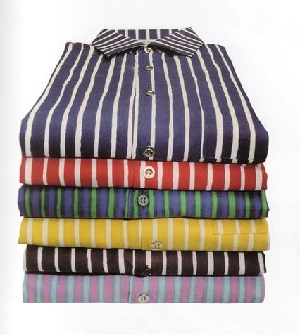
A stable was converted into a dye house with an indigo vat—indigo was the “greatest thrill” of Phyllis’s printing life. Their palette, mostly comprised of indigo, natural madder, galled iron, and cutch, was intentionally straightforward.

A balloon cotton dress featuring the print “Low” printed with madder.

An assistant raising cloth printed with “Flag” from the dye bath.

Wood and linoleum blocks were cut to their own designs and supplemented with impressions from found objects such as corrugated cardboard, rubber mats, and pastry cutters.

The blocks for “Motor,” for example, were a cut up rubber car mat mounted on wood.
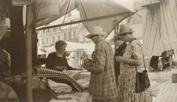
They also revived antique French and Russian blocks found a flea markets. Here is Phyllis and Dorothy searching for inspo at a French market stall.

“Christmas,” printed with nitric acid as a discharge agent on indigo.

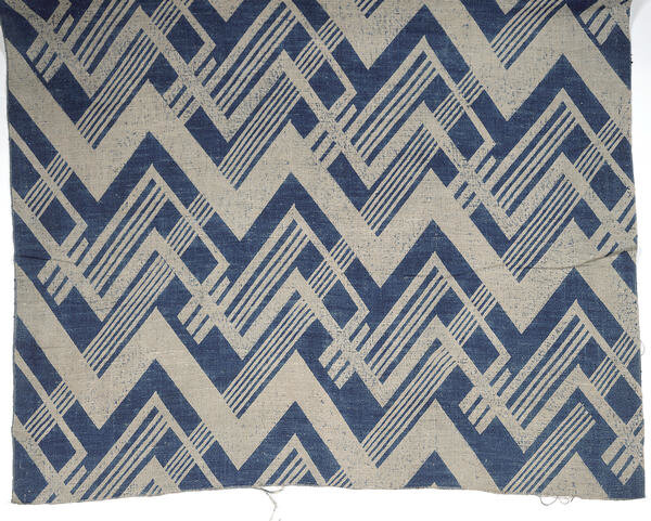
Phyllis at work. She was more into abstract geometrics. “A design isn’t dozens of little objects, or hungry-looking rectangular window panes: it is something that becomes a design by repeating, giving you something that a single pattern doesn’t give you. It took me many days to make the design repeat at all. Finally, to give it more flow, I printed it upside down.”

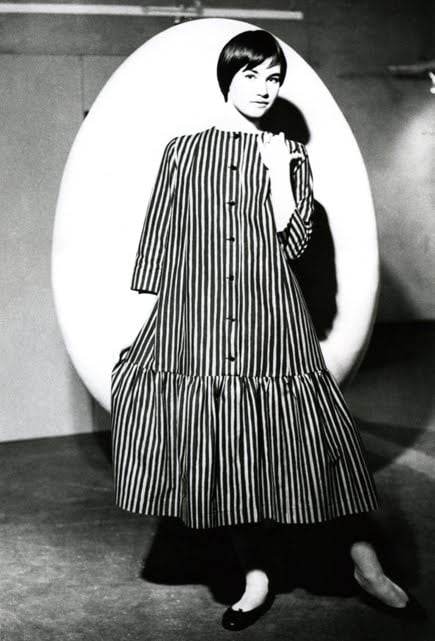
Vernède (c. late 1920s), named for the English poet and writer Robert Ernest Vernède (1875 – 9 April 1917). (This dress is available for sale along with others and detailed information at meg-andrews.com.)
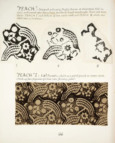
Peach (1921) process.

Peach in the world.
Coco was a fan: “When I showed my things to the Duke [of Westminster], Mademoiselle Chanel, who was living with him, was very interested. I think she thought I was a very queer sort of person – she couldn’t understand why I should want to do this strange thing. I was dressed as usual entirely in my own stuff, all made by myself, and I don’t think she had ever in her life seen so much hand sewing, which she really quite appreciated. She thought the whole affair rather amusing, and ordered cushions for her Paris gardens - lovely folding sort of mattress things - describing minutely how they were to be made.”

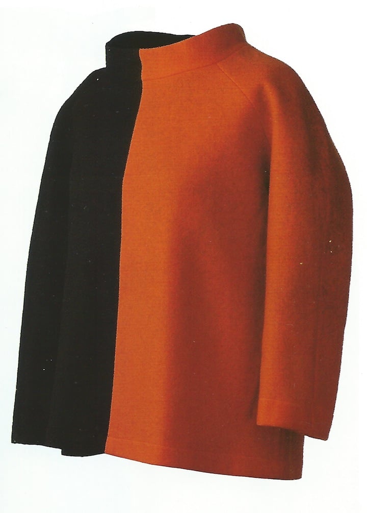
Hazlitt (1920s-1940s)
Girton (1920s-1940s).

Dorothy was more into designing floral patterns. L. Pattern (1920s-1940s) is hers.


Dissatisfactory star print overprinted x3 makes for joy.
Business boomed until World War II made working impossible. Phyllis and Dorothy never resumed printing, but thankfully Phyllis compiled a massive record of their work with the help of etcher Robin Tanner. This wonderful archive is available online through the Crafts Study Centre. There is also a prize of a book, Barron & Larcher: Textile Designers, edited by Michal Silver and Sarah Burns, recently published by Christopher Farr Cloth.